Supervised Learning
Supervised learning is the branch of Machine Learning (ML) that involves predicting labels, such as ‘Survived’ or ‘Not’. Such models learn from labelled data, which is data that includes whether a passenger survived (called “model training”), and then predict on unlabeled data.
These are generally called train and test sets because
- You want to build a model that learns patterns in the training set, and
- You then use the model to make predictions on the test set.
We can then calculate the percentage that you got correct: this is known as the accuracy of your model.
How To Start with Supervised Learning
As you might already know, a good way to approach supervised learning is the following:
- Perform an Exploratory Data Analysis (EDA) on your data set;
- Build a quick and dirty model, or a baseline model, which can serve as a comparison against later models that you will build;
- Iterate this process. You will do more EDA and build another model;
- Engineer features: take the features that you already have and combine them or extract more information from them to eventually come to the last point, which is
- Get a model that performs better.
A common practice in all supervised learning is the construction and use of the train- and test- datasets. This process takes all of the input randomly splits into the two datasets (training and test); the ratio of the split is usually up to the researcher, and can be anything: 80/20, 70/30, 60/40…
Supervised Learning I: classification
There are various classifiers available:
- Decision Trees – These are organized in the form of sets of questions and answers in the tree structure.
- Naive Bayes Classifiers – A probabilistic machine learning model that is used for classification.
- K-NN Classifiers – Based on the similarity measures like distance, it classifies new cases.
- Support Vector Machines – It is a non-probabilistic binary linear classifier that builds a model to classify a case into one of the two categories.
Decision trees
It is a type of supervised learning algorithm. We use it for classification problems. It works for both types of input and output variables. In this technique, we split the population into two or more homogeneous sets. Moreover, it is based on the most significant splitter/differentiator in input variables.
The Decision Tree is a powerful non-linear classifier. A Decision Tree makes use of a tree-like structure to generate relationship among the various features and potential outcomes. It makes use of branching decisions as its core structure.
There are two types of decision trees:
- Categorical (classification) Variable Decision Tree: Decision Tree which has a categorical target variable.
- Continuous (Regression) Variable Decision Tree: Decision Tree has a continuous target variable.
Regression trees are used when the dependent variable is continuous while classification trees are used when the dependent variable is categorical. In continuous, a value obtained is a mean response of observation. In classification, a value obtained by a terminal node is a mode of observations.
Here, we will use the rpart and the rpart.plot package in order to produce and visualize a decision tree. First of all, we’ll create the train and test datasets using a 70/30 ratio and a fixed seed so that we can reproduce the results.
# split into training and test subsets
set.seed(1000)
ind <- sample(2, nrow(breastCancerData), replace=TRUE, prob=c(0.7, 0.3))
breastCancerData.train <- breastCancerDataNoID[ind==1,]
breastCancerData.test <- breastCancerDataNoID[ind==2,]
Now, we will load the library and create our model. We would like to create a model that predicts the Diagnosis based on the mean of the radius and the area, as well as the SE of the texture. For ths reason we’ll use the notation of myFormula <- Diagnosis ~ Radius.Mean + Area.Mean + Texture.SE. If we wanted to create a prediction model based on all variables, we will have used myFormula <- Diagnosis ~ . instead. Finally, minsplit stands for the the minimum number of instances in a node so that it is split.
library(rpart)
library(rpart.plot)
myFormula <- Diagnosis ~ Radius.Mean + Area.Mean + Texture.SE

breastCancerData.model <- rpart(myFormula,
                                method = "class",
                                data = breastCancerData.train,
                                minsplit = 10,
                                minbucket = 1,
                                maxdepth = 3,
                                cp = -1)

print(breastCancerData.model$cptable)
rpart.plot(breastCancerData.model)
We see the following output and a figure:
      CP       nsplit rel error   xerror     xstd
1  0.69930070      0 1.0000000 1.0000000 0.06688883
2  0.02797203      1 0.3006993 0.3006993 0.04330166
3  0.00000000      2 0.2727273 0.3006993 0.04330166
4 -1.00000000      6 0.2727273 0.3006993 0.04330166
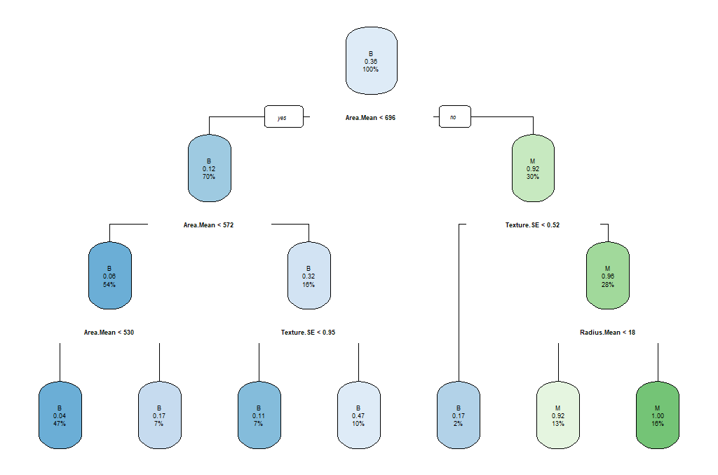
The parameters that we used reflect the following aspects of the model:
minsplit: the minimum number of instances in a node so that it is splitminbucket: the minimum allowed number of instances in each leaf of the treemaxdepth: the maximum depth of the treecp: parameter that controls the complexity for a split and is set intuitively (the larger its value, the more probable to apply pruning to the tree)
As we can observe, this might not be the best model. So we can select the tree with the minimum prediction error:
opt <- which.min(breastCancerData.model$cptable[, "xerror"])
cp <- breastCancerData.model$cptable[opt, "CP"]
# prune tree
breastCancerData.pruned.model <- prune(breastCancerData.model, cp = cp)
# plot tree
rpart.plot(breastCancerData.pruned.model)

table(predict(breastCancerData.pruned.model, type="class"), breastCancerData.train$Diagnosis)
The output now is the following Confusion Matrix and pruned tree:
    B    M
B  245  34
M   9   109
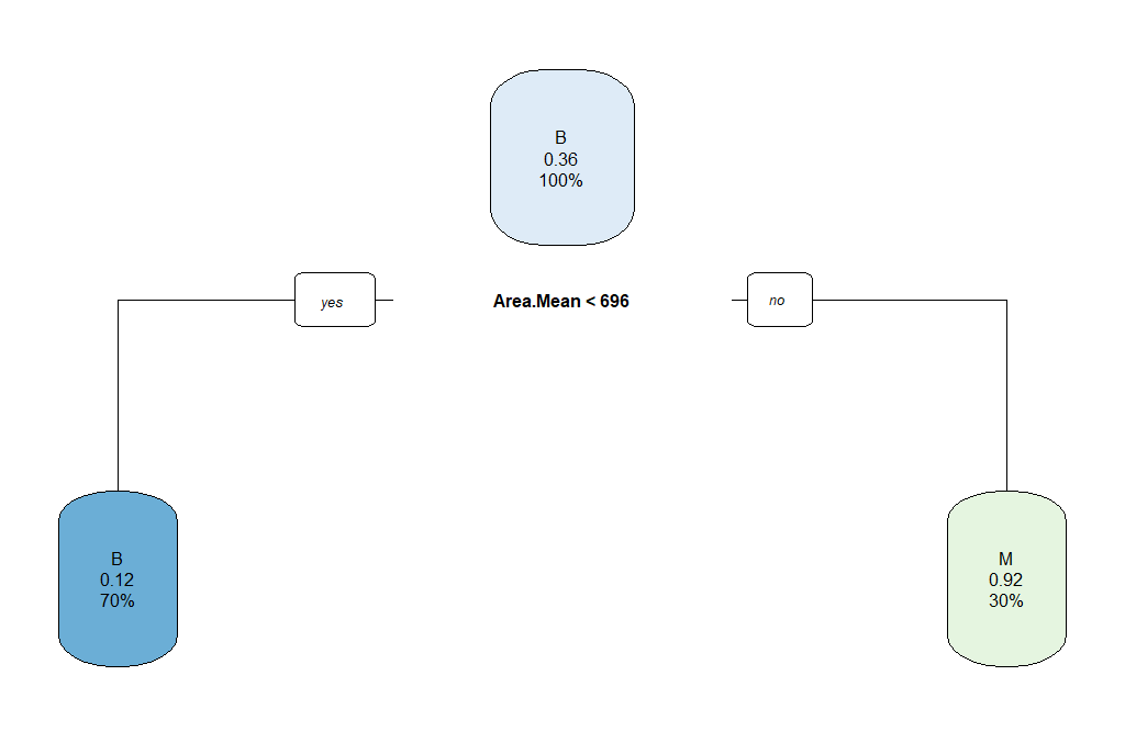
Question: What does the above “Confusion Matrix” tells you?
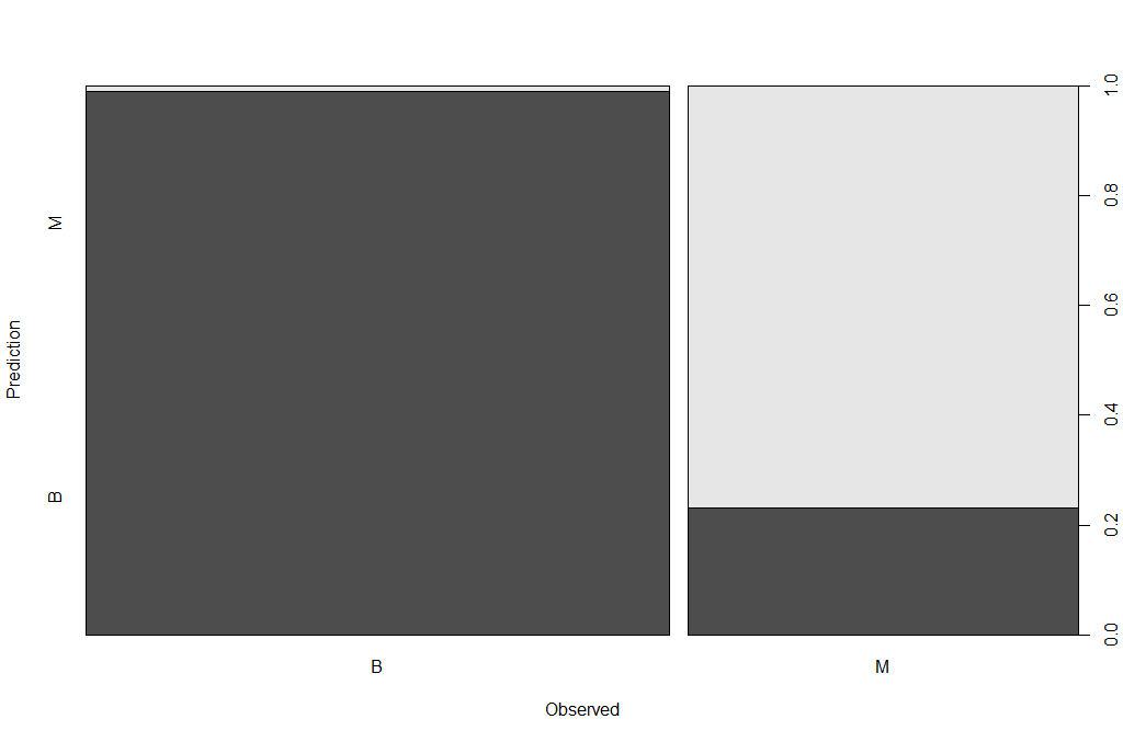
Now that we have a model, we should check how the prediction works in our test dataset.
## make prediction
BreastCancer_pred <- predict(breastCancerData.pruned.model, newdata = breastCancerData.test, type="class")
plot(BreastCancer_pred ~ Diagnosis, data = breastCancerData.test,
     xlab = "Observed",
     ylab = "Prediction")
table(BreastCancer_pred, breastCancerData.test$Diagnosis)
The new Confusion Matrix is the following:
BreastCancer_pred   B   M
                B 102  16
                M   1  53
| Exercises | |
|---|---|
| 1 | Can we improve the above model? What are the key parameters that have the most impact? |
| 2 | We have been using only some of the variables in our model. What is the impact of using all variables / features for our prediction? Is this a good or a bad plan? |
Random Forests
Random Forests is an ensemble learning technique, which essentially constructs multiple decision trees. Each tree is trained with a random sample of the training dataset and on a randomly chosen subspace. The final prediction result is derived from the predictions of all individual trees, with mean (for regression) or majority voting (for classification). The advantage is that it has better performance and is less likely to overfit than a single decision tree; however it has lower interpretability.
There are two main libraries in R that provide the functionality for Random Forest creation; the randomForest and the party: cforest().
Package randomForest
- very fast
- cannot handle data with missing values
- a limit of 32 to the maximum number of levels of each categorical attribute
- extensions: extendedForest, gradientForest
Package party: cforest()
- not limited to the above maximum levels
- slow
- needs more memory
In this exercise, we will be using the randomForest. First, let’s train the model:
library(randomForest)
set.seed(1000)
rf <- randomForest(Diagnosis ~ ., data = breastCancerData.train,
                   ntree=100,
                   proximity=T)

table(predict(rf), breastCancerData.train$Diagnosis)
The output is the following:
   B   M
B 249  12
M   5 131
We can also investigate the content of the model:
print(rf)
The output shows the individual components and internal parameters of the Random Forest model.
Call:
 randomForest(formula = Diagnosis ~ ., data = breastCancerData.train,      ntree = 100, proximity = T)
               Type of random forest: classification
                     Number of trees: 100
No. of variables tried at each split: 5

        OOB estimate of  error rate: 4.28%
Confusion matrix:
    B   M class.error
B 249   5  0.01968504
M  12 131  0.08391608
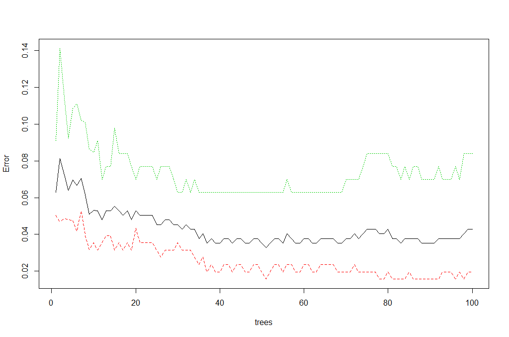
We can view the overall performance of the model here:
plot(rf, main = "")
We can also review which of the variables has the highest “importance” (i.e. impact to the performance of the model):
importance(rf)

varImpPlot(rf)
The output is the table and the figure below:
ID                             1.0244803
Radius.Mean                    7.8983552
Texture.Mean                   1.9614134
Perimeter.Mean                 9.3502914
Area.Mean                      7.3438007
Smoothness.Mean                0.7228277
Compactness.Mean               2.6595043
Concavity.Mean                11.2341661
Concave.Points.Mean           18.5940046
Symmetry.Mean                  0.8989458
Fractal.Dimension.Mean         0.7465322
Radius.SE                      3.1941672
Texture.SE                     0.6363906
Perimeter.SE                   2.4672730
Area.SE                        5.3446273
Smoothness.SE                  0.6089522
Compactness.SE                 0.7785777
Concavity.SE                   0.5576146
Concave.Points.SE              1.0314107
Symmetry.SE                    0.8839428
Fractal.Dimension.SE           0.6475348
Radius.Worst                  18.2035365
Texture.Worst                  3.2765864
Perimeter.Worst               25.3605679
Area.Worst                    17.1063000
Smoothness.Worst               2.1677456
Compactness.Worst              2.9489506
Concavity.Worst                6.0009637
Concave.Points.Worst          25.6081497
Symmetry.Worst                 2.1507714
Fractal.Dimension.Worst        1.1498020
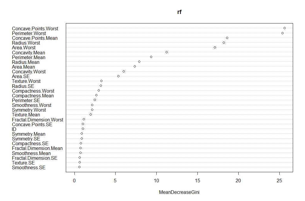
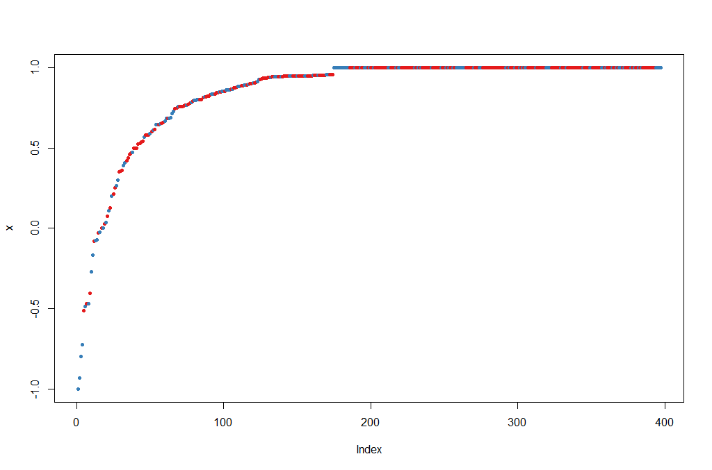
Let’s try to do a prediction of the Diagnosis for the test set, using the new model. The margin of a data point is as the proportion of votes for the correct class minus maximum proportion of votes for other classes. Positive margin means correct classification.
BreastCancer_pred_RD <- predict(rf, newdata = breastCancerData.test)
table(BreastCancer_pred_RD, breastCancerData.test$Diagnosis)

plot(margin(rf, breastCancerData.test$Diagnosis))
The output is the table and figure below:
BreastCancer_pred_RD   B   M
                   B 101   6
                   M   2  63
Feature selection: We can evaluate the prediction performance of models with reduced numbers of variables that are ranked by their importance.
result <- rfcv(breastCancerData.train, breastCancerData.train$Diagnosis, cv.fold=3)
with(result, plot(n.var, error.cv, log="x", type="o", lwd=2))

| Exercises | |
|---|---|
| 1 | ToDo |
| 2 | ToDo |
Supervised Learning II: regression
Linear regression
Linear regression is to predict response with a linear function of predictors. The most common function in R for this is lm. In our dataset, let’s try to investigate the relationship between Radius.Mean, Concave.Points.Mean and Area.Mean. We can get a first impression by looking at the correlation of these variables:
## correlation between Radius.Mean and Concave.Points.Mean / Area.Mean
cor(breastCancerData$Radius.Mean, breastCancerData$Concave.Points.Mean)
## [1] 0.8225285
cor(breastCancerData$Concave.Points.Mean, breastCancerData$Area.Mean)
## [1] 0.8232689
Lets create a short version of our data
bc <- select(breastCancerData,Radius.Mean,Concave.Points.Mean,Area.Mean)
Let’s build now a linear regression model with function lm() on the whole dataset:
bc_model_full <- lm(Radius.Mean ~ Concave.Points.Mean + Area.Mean, data=bc)
bc_model_full
The output is the following:
Call:
lm(formula = Radius.Mean ~ ., data = bc)

Coefficients:
        (Intercept)  Concave.Points.Mean            Area.Mean
            7.68087              2.72493              0.00964
This tells us what are the coefficients of Concave.Points.Mean and Area.Mean, in the linear equation that connects them to Radius.Mean. Let’s see if we can predict now the mean radius of a new sample, with Concave.Points.Mean = 2.724931 and Area.Mean = 0.00964.
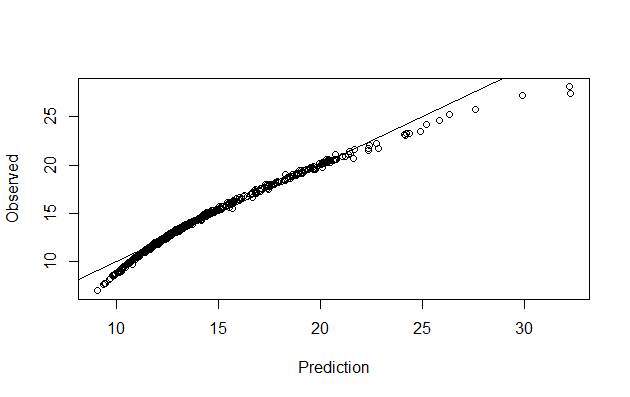
Let’s make predictions on our training dataset and visualize
preds <- predict(bc_model_full)

plot(preds, bc$Radius.Mean, xlab = "Prediction", ylab = "Observed")
abline(a = 0, b = 1)
We can also have a better look at what the model contains with summary(bc_model_full):
Call:
lm(formula = Radius.Mean ~ ., data = bc)

Residuals:
    Min      1Q  Median      3Q     Max
-4.8307 -0.1827  0.1497  0.3608  0.7411

Coefficients:
                     Estimate Std. Error t value Pr(>|t|)
(Intercept)         7.6808702  0.0505533 151.936   <2e-16 ***
Concave.Points.Mean 2.7249328  1.0598070   2.571   0.0104 *
Area.Mean           0.0096400  0.0001169  82.494   <2e-16 ***
---
Signif. codes:  0 ‘***’ 0.001 ‘**’ 0.01 ‘*’ 0.05 ‘.’ 0.1 ‘ ’ 1

Residual standard error: 0.5563 on 566 degrees of freedom
Multiple R-squared:  0.9752,	Adjusted R-squared:  0.9751
F-statistic: 1.111e+04 on 2 and 566 DF,  p-value: < 2.2e-16
But his only provides the evaluation on the whole datset that we sued for training. we don’t know how it will perform on unknown dataset. So, let’s split our dataset into training and test set, create the model on trainign set and visualize the predictions
set.seed(123)
ind <- sample(2, nrow(bc), replace=TRUE, prob=c(0.75, 0.25))
bc_train <- bc[ind==1,]
bc_test <- bc[ind==2,]


#Let's build now a linear regression model using the training data and print it:
(bc_model <- lm(Radius.Mean ~ Concave.Points.Mean + Area.Mean, data=bc_train))

#We can also view the model's summary
summary(bc_model)


######Evaluating graphically
#Let's make predictions on our training dataset and store the predictions as a new column
bc_train$pred <- predict(bc_model)

# plot the ground truths vs predictions for training set
ggplot(bc_train, aes(x = pred, y = Radius.Mean)) +
  geom_point() +
  geom_abline(color = "blue")
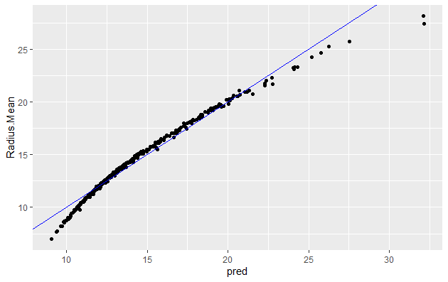
You will note that it is quite similar to when using whole dataset
Let’s predict using test data bc_test$pred <- predict(bc_model , newdata=bc_test)
# plot the ground truths vs predictions for test set and examine the plot. Does it look as good with the predictions on the training set?
ggplot(bc_test, aes(x = pred, y = Radius.Mean)) +
  geom_point() +
  geom_abline(color = "blue")
Now let’s use the RMSE and the R_square metrics to evaluate our model on the training and test set.
#####1. Evaluating model using RMSE - on training set
#Calculate residuals
res <- bc_train$Radius.Mean-bc_train$pred
#For training data we can also obtain the residuals using the bc_model$residuals

# Calculate RMSE, assign it to the variable rmse and print it
(rmse <- sqrt(mean(res^2)))
[1] 0.5624438

# Calculate the standard deviation of actual outcome and print it
(sd_bc_train <- sd(bc_train$Radius.Mean))
[1] 3.494182
So we can see that our RMSE is very small compared to SD, hence it is a good model
######Exercise 1 Calculate RMSE for the test data and check if the model is not overfit.
#####2. Evaluating model using R Square - on training set
# Calculate mean of outcome: bc_mean. Print it
bc_mean <- mean(bc_train$Radius.Mean)

# Calculate total sum of squares: tss. Print it
tss <- sum((bc_train$Radius.Mean - bc_mean)^2)

# Calculate residual sum of squares: rss. Print it
err <- bc_train$Radius.Mean-bc_train$pred
rss <- sum(err^2)

# Calculate R-squared: rsq. Print it. Is it a good fit?
(rsq <- 1-(rss/tss))
[1] 0.974028
This again confirms that our model is very good as the R_Square value is very close to 1
Exercise 2 Calculate R_Square for the test data and check if the model is not overfit.
Generalized Linear Model (GLM)
GLM, as the name implies, generalizes linear regression by allowing the linear model to be related to the response variable via a link function and allowing the magnitude of the variance of each measurement to be a function of its predicted value. It unifies various other statistical models, including linear regression, logistic regression and Poisson regression. The corresponding function is glm(); it fits generalized linear models, specified by giving a symbolic description of the linear predictor and a description of the error distribution.
We will perform Linear Regression using GLM with family =Gaussian. GLM with the log link function we are modeling the linear regression as ln(f(y)). type for response indicates the type of prediction required. The default is on the scale of the linear predictors, and the alternative “response” is on the scale of the response variable.
And we will do visualization and calculate RMSE adn RSquare for the training data after generating our model and compare the results for linear regression we got above.
myFormula <-Radius.Mean ~ Concave.Points.Mean + Area.Mean
bc_model2 <-glm(myFormula, family=gaussian("log"),data=bc_train)

summary(bc_model2)
The output is the following:
Call:
glm(formula = myFormula, family = gaussian("log"), data = bc_train)

Deviance Residuals:
    Min       1Q   Median       3Q      Max
-8.8018  -0.5850   0.1779   0.7005   1.8351

Coefficients:
                     Estimate Std. Error t value Pr(>|t|)
(Intercept)         2.285e+00  7.747e-03  294.89  < 2e-16 ***
Concave.Points.Mean 8.571e-01  1.517e-01    5.65 2.98e-08 ***
Area.Mean           4.639e-04  1.476e-05   31.44  < 2e-16 ***
---
Signif. codes:  0 ‘***’ 0.001 ‘**’ 0.01 ‘*’ 0.05 ‘.’ 0.1 ‘ ’ 1

(Dispersion parameter for gaussian family taken to be 1.303883)

    Null deviance: 5103.49  on 418  degrees of freedom
Residual deviance:  542.41  on 416  degrees of freedom
AIC: 1305.2

Number of Fisher Scoring iterations: 6
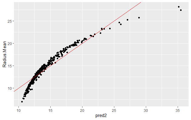
We can now make prediction and visualize the result:
bc_train$pred2 <-predict(bc_model2,type = "response")

ggplot(bc_train, aes(x = pred2, y = Radius.Mean)) +
  geom_point() +
  geom_abline(color = "blue")


######RMSE
res <- bc_train$Radius.Mean-bc_train$pred2

(rmse <- sqrt(mean(res^2)))
[1] 1.137781

# Calculate the standard deviation of actual outcome and print it
(sd_bc_train <- sd(bc_train$Radius.Mean))
[1] 3.494182

######R_Sq
# Calculate mean of outcome: bc_mean.
bc_mean <- mean(bc_train$Radius.Mean)

# Calculate total sum of squares: tss
tss <- sum((bc_train$Radius.Mean - bc_mean)^2)

# Calculate residual sum of squares: rss.
err <- bc_train$Radius.Mean-bc_train$pred2
rss <- sum(err^2)

# Calculate R-squared: rsq. Print it. Is it a good fit?
(rsq <- 1-(rss/tss))
[1] 0.8937169
The plot, the value of RMSE (higher than in linear regression) and RSquare (lower than that for linear regression) indicates that this model is not as good as linear regression.
| Exercises | |
|---|---|
| 1 | Try working with additional columns as targets for the regression. |